White? Eggshell? Cornsilk? With all these different hues, selecting the colour palette that best suits your vibe is not easy. But, it’s one of the most important decisions in shaping the overall mood and aesthetic of your space. Not only that, but choosing an overall colour scheme will impact your flooring choices, paint choices, furniture and more. There’s a lot to think about.
Whether it’s updating a single room or revamping your entire home, the right colours create harmony, enhance natural light, and even influence how spacious a room feels. Here are five tips to help you choose the perfect colour palette for every room in your home.
1. Consider the mood you want to create
Colours profoundly affect mood, so it’s essential to think about how you want each room to feel before selecting a palette. Different shades evoke different emotions, so they’re a great starting point for setting the tone of your space. Here are some examples to get you started:
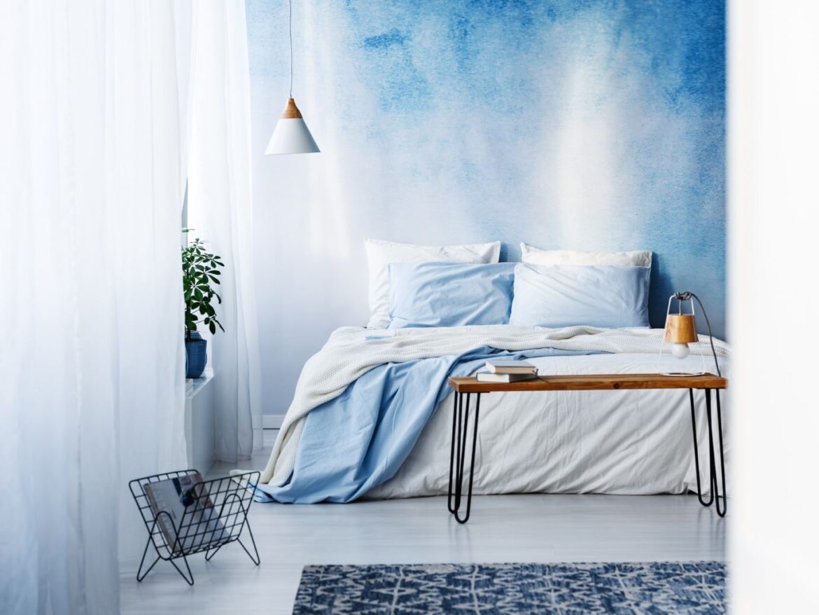
- Zenful vibes: Soft blues, muted greens, and neutral tones are ideal for bedrooms and bathrooms, where relaxation is key.
- Lively: Warm tones like terracotta, golden yellows, and rich reds add vibrancy to social spaces like living rooms and dining areas.
- Neutral and soft: Soft greys, taupes, and off-whites work well in transitional spaces like hallways or open-plan areas, creating a seamless and timeless look.
By defining how you’d like the room to feel first, you can ensure your colour choices enhance the function and mood of each space.
2. Work with natural and artificial light
Lighting plays a crucial role in how colours appear throughout the day. A shade that looks perfect in the store or in one room may appear entirely different under natural or artificial light in another space. Keep these things in mind:
- Spaces that face north usually receive a cooler type of light, so colours in here will seem a bit muted. To balance this, warmer tones like beige, peach, or creamy white work well. Hybrid flooring is ideal for this, as it offers a variety of lighter shades that perfectly complement your chosen colour palette, enhancing the warmth and harmony of the space.
- Rooms that face south benefit from greater natural sunlight, so you can use a greater range of colours in here, including deep tones as well as paler ones to give an airy feel. Experiment with darker flooring, bold paint choices and complementary decor.
- Artificial lighting can alter the way colours are perceived. Warm white bulbs enhance cosy tones, while cooler LED lighting complements crisp whites and modern neutrals.
Before finalising your choice, test paint swatches at different times of the day to see how the colours shift under various lighting conditions.
3. Create flow and harmony between rooms
If your home has an open floor plan or connected spaces, choosing colours that create a cohesive flow is key. While each room doesn’t need to be the same colour, they should complement each other. A few ways you can achieve harmony include:
- Adding a neutral base colour that appears throughout multiple rooms (such as a soft white, greige, or taupe) and layer in accent colours.
- Using variations of the same hue in different spaces maintains continuity without feeling repetitive.
- Incorporate a consistent trim or ceiling colour to tie everything together seamlessly.
Maintaining visual consistency between rooms creates a more polished and well-thought-out design, making your home feel unified and inviting.

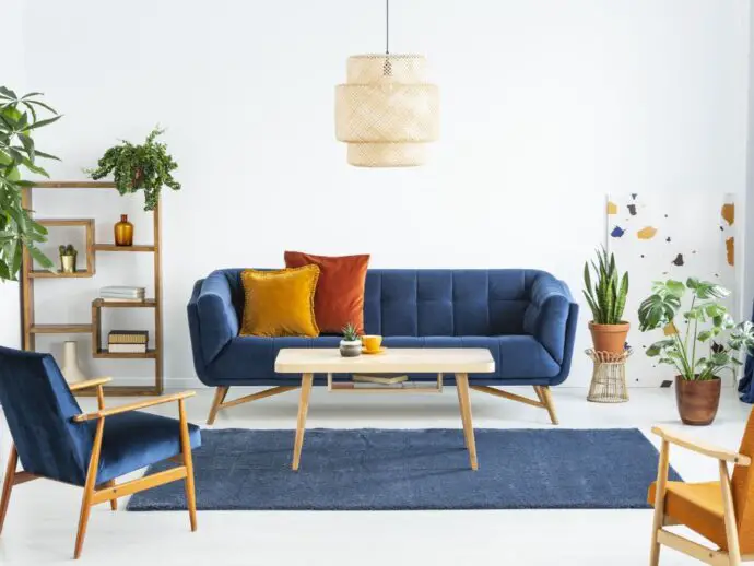
4. Use the 60-30-10 rule for balanced colour schemes
A tried-and-true design principle, the 60-30-10 rule helps create balanced and visually appealing colour schemes.
- To establish the overall tone of the room, 60% of the space should be a dominant colour, such as walls or large furniture pieces.
- 30% should be a secondary colour, often seen in furniture such as a cosy deep seat sectional, rugs, or statement pieces, to add depth and contrast.
- 10% should be an accent colour, incorporated through décor, artwork, or smaller accessories to inject personality and interest.
This method ensures a harmonious balance without overwhelming the space, making it easier to introduce bold or unexpected colour choices in a controlled way.
5. Test before you commit
Even with careful planning, colours can look different once applied to your walls or incorporated into your décor. Before committing to a final palette, consider these steps:
- Stick paint swatches on the wall and observe them at different times of the day to see how lighting affects the colour.
- Compare these against existing furnishings to ensure the colours complement your furniture, flooring, and décor elements.
- Use large sample boards rather than small swatches to better understand how a colour will look in a larger space.
Taking the time to test your choices prevents costly mistakes and ensures you achieve the desired effect in your space.
Ready to change up your home’s colour palette?
Selecting the perfect colour palette is more than choosing nice shades—it’s about creating a cohesive, inviting, and functional space that reflects your style and enhances your home’s overall feel. If you’re trying to recreate that holiday feel at home or just fancy a room refresh, by considering mood, lighting, flow, balance, and testing before committing, you’ll be well on your way to designing a stylish and comfortable space. Whether you prefer timeless neutrals, bold hues, or subtle pastels, the right colours can transform any room into a space that truly feels like home.