Colour and texture plays an important role in interior design, helping to transform the overall feel of your home. The colour palette you choose can influence your mood and evoke different emotions. Whether you want to feel inspired, relaxed or cheerful — it’s all about colour balance.
Then, there’s texture. A mix of surfaces can help add depth and visual interest to a room. Elements that are rough, smooth and everything in-between can create a sensory experience and add personality to your space.
Combining colours and textures is an art, and can involve trying new combinations and elements. Let’s take a closer look at how to mix and match colours and textures so that you can create an inviting and visually pleasing home.
Understanding the colour wheel
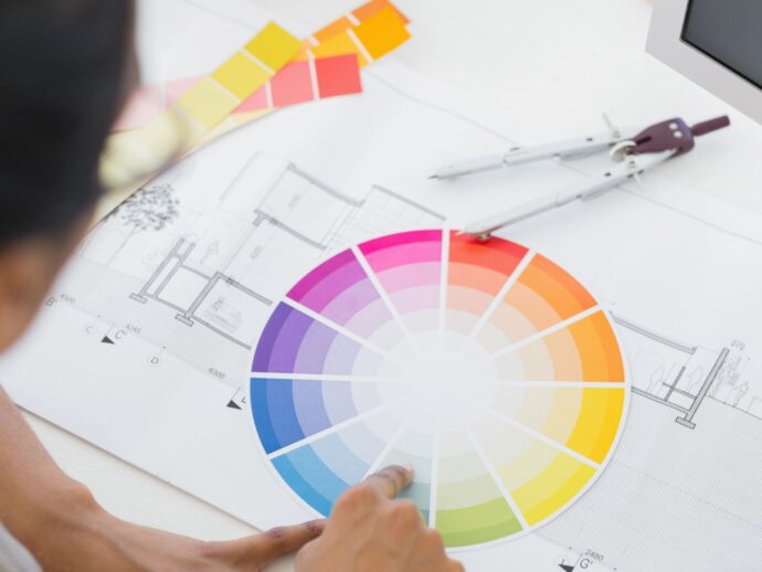
The colour wheel is an important part of understanding how colours complement each other. This simple device is often used in design and is a circle with primary, secondary and tertiary colours. It shows how the colours relate to each other, showing which work well together and which don’t. You have a range of options to choose from, including:
- Complementary colours: colours that sit opposite on the colour wheel. For example, yellow and purple, orange and blue, and red and green.
- Analogous colours: three hues that sit next to each other on the colour wheel. For example, blue-green, blue and blue-purple.
- Warm or cool colours: warm colours sit at the top of the colour wheel. For example, red, orange, yellow and pink. Cool colours sit at the bottom and include blue, green and purple.
Neutral tones such as beige, white, brown, grey and black aren’t on the colour wheel. But, this doesn’t mean they don’t have a place in your interior design. In fact, they’re often used to balance out colours, creating a cohesive colour palette that isn’t overwhelming.
Weave depth into your designs with textures
Once you have chosen your colour palette, it’s time to weave texture into your design. Textures are the tactile qualities in a room and come in many forms, from smooth to rough. The key to using texture is to combine more than one type. For example, you can have a leather sofa with layered cushions in different fabrics.
You can incorporate texture into your:
- Window coverings: try soft flowing fabrics or wooden planter shutters.
- Floor rugs: try wool and other natural fibres.
- Coffee tables: try combining wood with glass or metallics.
- Storage: try woven baskets or rattan shelving.
- Walls: try textured wallpaper or embellished artwork.
- Flooring: designs like wood-look premium vinyl can help add warmth to your floors.
- Furniture: mix wood and glass with fabrics.
How colours can influence the mood
The colours you surround yourself with can play a role in how you feel. Ask yourself what colours you’re naturally drawn to and how they make you feel. After all, your colour palette will be a personal choice and can depend on how you want the room to feel.
Here are some common accent colours and the type of feelings they can evoke:
- Red can create a warm mood. It’s often associated with feeling lively and energetic and can be a great addition to a living space.
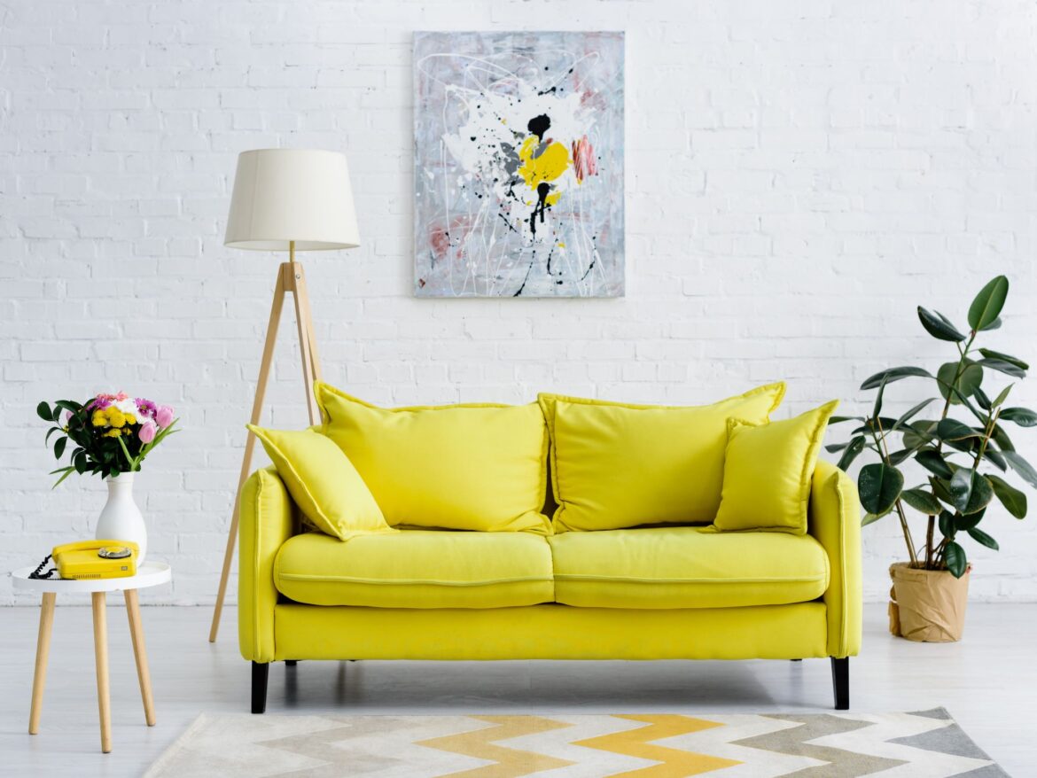
- Yellow can be a great pop of bright colour. Often associated with feelings of happiness and friendliness, it can be overwhelming so stick to small splashes of this hue.
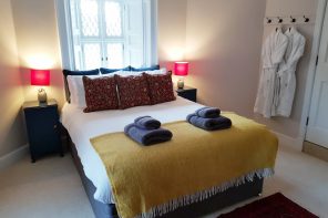
- Pink is a great soothing option. Calming, romantic and feminine, it works best in bedrooms and nurseries.
- Green is ideal for creating a warm, yet calming space. Often associated with luck and nature, it’s a good fit for almost any room in your home.
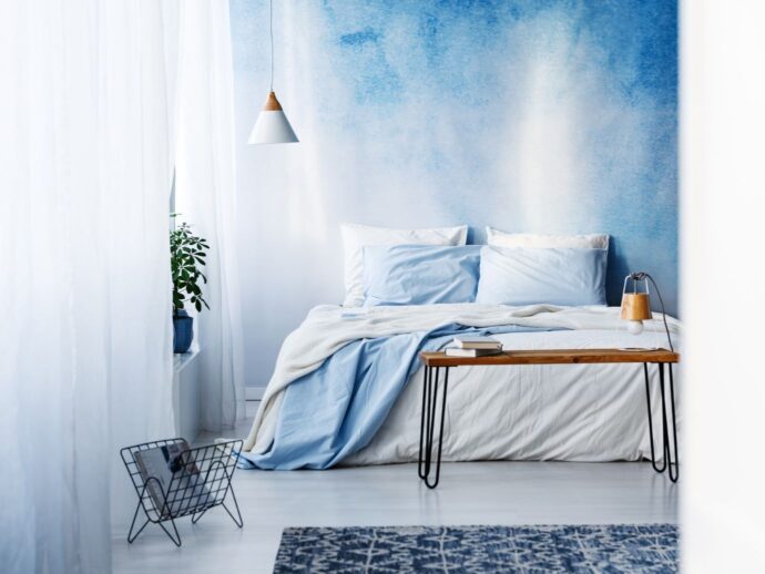
- Blue is often the go-to colour for creating a soothing and serene space. It’s the ideal shade for rooms like bedrooms and living rooms.
Balancing act: harmonising colours and textures
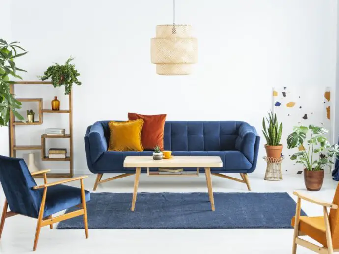
Even if you choose your favourite colour, there is such a thing as too much. Interior designers often use a 60-30-10 rule. In this scenario, 60% of the space will be a dominant colour with neutrals genuinely recommended for the walls or larger items.
With your main colour in mind, go back to the colour wheel to determine your second and third hues. If you’re looking for complementary colours you could use 30% blue and add 10% orange. Any textural pieces you add will fit this design rule. A shaggy orange cushion on a woven blue sofa will give the room some flair.
From theory to practice
Interior design should be fun and about what suits you and your space. Remember that your rooms will be as unique as you are, so you shouldn’t be afraid to experiment. Before you get started, you can pull pictures of design elements like furniture, colours and patterns into a vision board. Bringing these elements together can help you figure out what works together and what doesn’t. Plus, it’s a good idea to get everything laid out together before you commit to big decisions.
Create a fearlessly vibrant space
Colour and texture can bring any room to life. Watch your interior bloom as you add a range of elements that are tied together with the same colour theme. While colour theory and design strategies can help you plan your space, there are no strict rules. Remember to mix and match to put your own stamp on things and create a room that’s you.